Brand assets
Brand elements
Wordmark
LiveKit primary logo is the wordmark. It should be used in most cases to clearly represent LiveKit brand. When referring to our brand in writing, use LiveKit as the preferred form. Avoid using variations such as LIVEKIT, Livekit, or any other modifications.
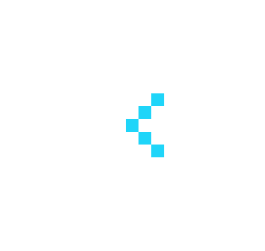
Symbol
The LiveKit symbol serves as a compact, recognizable representation of our brand. Designed for scalability, it maintains clarity in small spaces such as app icons, avatars, and other minimal layouts.
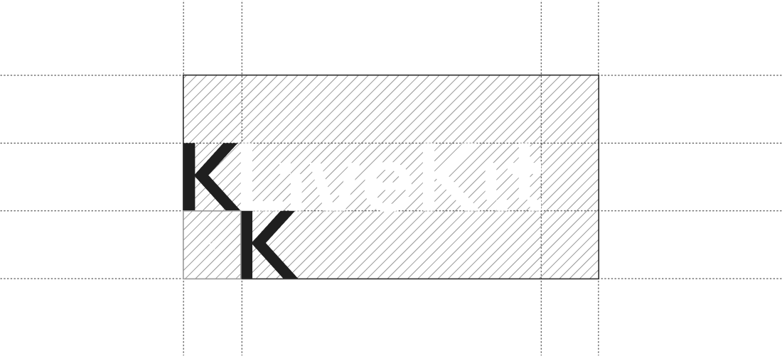
Clearance
The clear space around the wordmark ensures it remains distinct and unobstructed. This space is proportional to the logotype's height, with x representing the minimum required clearance. Whenever possible, allow more than the specified minimum to enhance visibility and impact.
Colors
LiveKit's brand colors are minimal and intentional. In dark mode, cyan delivers a strong accent that highlights key actions. In light mode, blue carries the same strength and clarity ensuring balance across themes. A rich near-black grounds dark interfaces, while a bright near-white does the same in light mode, together they create clarity and contrast in realtime environments.
Dark Mode
Light Mode
Ready to build?
Start building a voice AI agent with a free account. Reach out to us if you're interested in custom pricing.
No credit card required • 1,000 free agent session minutes monthly